Category: edci337–blog

Sketchnoting

This is my Bad News score.

The game follows the coherence principle. There is some picture that relates to the words. The game doesn’t follow the segmenting principle. In my opinion, some sections are too long and too many words to read. If I could improve this game, I will make the game be shorter.
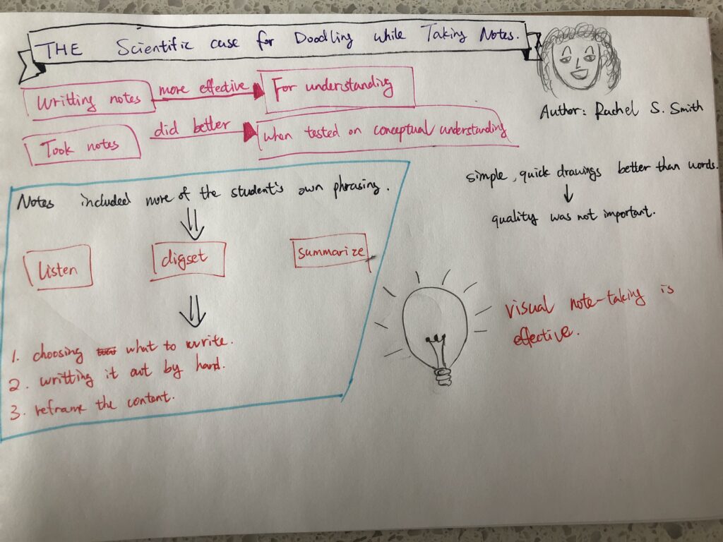
This is my sketchnote.

The sketchnote relates to the coherence principle, signaling principle, contiguity principle, and segmenting principle. I think sketchnote is very helpful to me. When we taking notes in class or for an article, we need summary the most important concept. Especially in class, we might not able to follow the professor if we write down all the words. Therefore, sketchnote could help us highlight the knowledge. We are using hands-on skill-building, discussion, and reflective blogging in EDCI 337.

Twine Story

My Twine Story

Two Multimedia Principles that directly relate to my Twine story:

  • coherence principle
  • signaling principle

First, there are not extra pictures or words that unrelated to my story. The reader could clearly read and understand my story. Second, I add a highlight title at the end of each passage. It gives the reader a hint of what will happen next. I use these two principles to make the story be simple and short.

In my opinion, the Twine story is very nice for educational purposes. As we know, only text or words will make the lesson be boring and exhausted. The Twine story could add lots of multimedia elements. This is will make the lesson be interesting. For example, the economic instructor could combine the theory and graphs that use the Twine story. I believe it will be better than only theory.

Evaluation of Video

Google Earth 360-tour:

https://earth.google.com/earth/rpc/cc/drive?state=%7B%22ids%22%3A%5B%2218d706cmv_1ImqPS18I1HHWmRgBH2KfFU%22%5D%2C%22action%22%3A%22open%22%2C%22userId%22%3A%22108079808718786914349%22%2C%22resourceKeys%22%3A%7B%7D%7D&usp=sharing

Evaluate:

SECTIONS model is a nice model to evaluate interactive video. It includes lots of aspects. For example, the cost of the video, teaching function, and organizational issues. When I use the SECTIONS model to evaluate my H5P interactive video. I find that there are some weaknesses.

  • The game is too easy and does not need to teach. I don’t need to figure out what kinds of students I am trying to teach.
  • The quality of interaction in this video is not good. For example, the multiple-choice is too easy.

Also, there are some strengths.

  • There is no cost for the interactive video.
  • It is easy to use.
  • It directly shows to people where and how to play this game.

Why I choose this evaluation framework :

I think this framework concludes with more aspects than SAMR.

Multimedia principles:

There are two principles that are directly related to my video. “Keep it simple, keep it short”. My video is very simple which teach people how to play the online music game. And show the process directly in the video. Meanwhile, the video is short. It does not cost people lots of time.


Reference: https://via.hypothes.is/https://wiki.ubc.ca/Documentation:Design_Principles_for_Multimedia


Why multimedia lesson plan and H5P is important?

After listening to the interview about the important components of lesson planning, I get some ideas about the multimedia lesson plan. First of all, making a lesson plan could give a hint about what the learners need. Also, it gives the instructor background about the lesson.  For example, what is the goal of this lesson, what requirement of this lesson. It is easy and powerful to make the lesson better. So, creating a lesson plan is important.

In my opinion, embed multiple-choice questions into the multimedia video could help learners directly know what they get in this lesson. It could make a boring lesson be interesting.


More Music Games


More about Multimedia Learning Principles

Dr. Ray explained six multimedia learning principles in his video. In my opinion, the spatial& temporal contiguity principle is the best principle that applies to a PowerPoint presentation in a classroom or face-to-face business meeting. When we do a PowerPoint presentation, if the image and words separately, the audience may not follow your step. They need to recall your image or words.

I have intuitively followed the spatial&temporal contiguity principle in the past. From middle school to the present, I did lots of PowerPoint presentations. I found that put images and words together is very effective. As Dr.Ray said, too much spatial increase cognitive load. It may cost too much time in class or meeting. I have broken the coherence principle in the past. I remembered when I was in middle school, I sometimes embed some interesting but irrelevant images to my topic. This causes the audience to pay more attention to the image than to what I’m saying.

Reference:https://www.youtube.com/watch?v=g-sknUVq1mk

Weekly Blog 2

Dual Coding Theory

Dual Coding Theory helps me to understand how to create a better PowerPoint presentation. After listening to the audio and watching the short video, I realize how important visual and sound in a PowerPoint presentation. To make a PowerPoint presentation be interesting and memorable, multimedia learning is the essential element.  Only text will make the presentation be boring. In addition, too much text will be overload for the audience.  I could add images, sounds, and short films to my PowerPoint. The image and sound help the audience remember what I am saying.  This could make my presentation be more effective and have a nice connection with the audience.

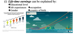
I remembered when I took ECON245 and ECON246, my instructor made a nice PowerPoint that includes lots of images to make the course be funny.

These are all the screenshots from my ECON 246 course.

Hypothesis
  • Potential Benefit: Students could communicate timely.
  • Potential Benefit:  View others’ opinions and thought.
  • Potential Benefit:  Learn from each other.
  • Potential Drawback:  Everyone in the group could make annotations, so students may effect by some wrong annotations.
  • Potential Drawback: Too much annotation makes the file unclear to view.

Weekly Blog 1

A Nice Multimedia Learning Experience

In my own experience, the learning of Korean is the best example of multimedia learning. I remembered that I took the Korean class at Camosun College. My Korean instructor is very nice. She uses multimedia very well. There are lots of images and videos in class. For example, lots of people are fancy in K-POP. So she plays one music video every class when we take a break. When we study new vocabulary, she will use some images to help us memorize them quickly. Because of multimedia learning, I get a high grade in this course and I could communicate basic Korean with others.

This is an example of an image to memorize vocabulary from linguajunkie.com. The link to the image

 One Thing I Hope To Get Out 

I understand how useful interactive and multimedia learning. However, how to choose the right method or resource is not easy. I had used some irrelevant resource when I make my assignment presentation at middle school. Therefore, I want to figure out how to use multimedia learning correctly.

Powered by WordPress & Theme by Anders Norén